Showing posts with label art. Show all posts

Saturday, May 14, 2011

Design It: Pantone

Photobucket
Photobucket

Another "Design It" post! I just couldn't help myself I am in love with everything Pantone! For those of you who are not giant nerds; Pantone books are the universal color books used by designers everywhere. Say I wanted to print a giant poster for a new super cool band and I found just the perfect shade of yellow for the sunrise vector I created for the background. Well imagine my excitement when the poster arrives, I unroll it and ECK! it is not the beautiful burnt yellow I picked but more like a neon yellow that belongs only on 80's related memorabilia. The problem was I saw a much different color on my computer screen (because of the light being projected behind it/ my personal brightness settings/ the light in the room I was working on it in ect.) then the actual color being printed. In order to avoid this color catastrophe Pantone books were created so that no matter where you are in the world the color you want will be the color you get. Each color is assigned a number which can be plugged into the design you are working on to ensure color perfection. Not only are Pantone books a great way to keep designers and printers from going insane, but the books themselves are designed pretty darn well. They are simple, sleek and straight to the point. My kind of design! I am honestly in love with all of the Pantone items below but I have been super duper wanting the iPhone case!! If only I could find a place in the US that doesn't charge $30 shipping...
Photobucket
2. Pantone iPhone Cover (i want soooo bad!)

Tuesday, February 8, 2011

Design It: Penguin Classics

Photobucket
Photobucket

I don't know about you, but when I see an orange Penguin Classic book I can not help but get excited. Their design is so simple yet beautiful! I am a strong believer in simplicity. A good design does not need ten million things going on at once to grab your attention. In fact, busy designs tend to hurt my brain because it does not know where to focus it's attention. When I am designing I like to use the common fashion rule: "Look in the mirror and take off one accessory before leaving the house." Except I change it to "Take one excessive part of the design out before sending it to the printer." Clean, simple designs have so much more of an impact on the viewer and are usually the most memorable. For instance, I bet you could see the binding of a Penguin Classic cover from across the room and know exactly who the publisher is. That orange and cream cover will forever represent Penguin books in your mind. I actually have been seeing less and less of these beautiful covers around lately. I believe they are pretty rare in the US, but thankfully they are available in other countries. Well, lucky for those of you in England and Australia (I am so jealous!). Below are some of the great products Penguin sells with their iconic orange and cream cover. I am in LOVE with the Jane Eyre mug!!
Photobucket

Tuesday, October 19, 2010

Typography

Oh my goodness this is bad I have not blogged in more then a week! We'll let me show you one of the things I have been working on... For Typography class I had to create a poster portraying a historically important figure in Typographic history. I choose John Baskerville because I really love his font (also called Baskerville). It is a super classic, beautiful type face, and I love it! For my poster I wanted to create images that were similar to the metal type used in old printing presses. Inside I put his name (in his own font) and and the bottom I put the name of his type face. Which is ironically the same thing (or not so ironically...), but I still like how it looks together. I actually enjoyed this project and really hope I get a good grade, fingers crossed!! Anyway, here is the final product...


P.S. How cute is the new design Anthropologie has done to their website, the bookstore is my favorite, check it out...

Tuesday, September 7, 2010

Inspired by It: Tim Walker

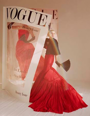
I LOVE Tim Walker. He is a brilliant photographer and one of my favorites, if not my absolute favorite. He is a British photographer who uses fantasy like props to help create a charming and visually beautiful composition. Sometimes he uses over sized objects or sets up ridiculously surreal scenes. His photos have a beautiful dream like feel which I absolutely love. They are very imaginative and completely stunning. He primarily works in fashion photography and you may have even seen his pictures in issues of Vogue and Harper's Bazaar. I would LOVE to have a copy of his book Pictures, but it is a little out of my price range at the moment. Thank goodness for the internet...


All images via Google Images

Thursday, September 2, 2010

Type Project: Self Portrait


I have finished my first project of the semester! Thank God!! It was for type class. We had to first pick a font that described us as person. I picked Tuna and Hot Dogs on Rye from Dafont because it was cutsie and fun. I hope that describes me... I also loveeeed that it had swirls in it. Like I said before I am OBSESSED with swirls. Next we had to pick a picture of ourselves to work from. I picked the one below because I wanted a picture where my hair was curly, and I liked that my eyes were closed (didn't have to tackle the eyes then... sneaky, I know). Finally we had to create a self portrait out of the type we had chosen, using only the letters in our name. I guess it wasn't too bad... It did take a little bit of time because I have not completely mastered Illustrator yet, but I am getting there! Of course I played up my curly hair with the giant swirls, which is probably my favorite part.

1. Pick Font


2. Pick Photo


3. Put Them Together

Saturday, August 28, 2010

Featured Favorite: Nan Lawson Etsy Shop

I love the prints in this Etsy Shop! They are so cute and whimsical, I just want them all (especially this very first one with the mustache)! Nan does a great job of incorporating adorable quirky characters into her amazing illustrations. I especially love that she does custom portraits. They are usually of precious couples (the last four in this post are commissioned work). She also includes some original characters like these first four portraits. How awesome is her "I'm not a hipster I just dress like one" illustration?! I completely agree with that one! I sometimes dress like a hipster, but I def. am not one. First of all I don't smoke, and second of all i don't have a bearded boyfriend who wears Buddy Holly readers... Not that I would mind one of those... To check out the rest of her work click HERE.


Saturday, July 10, 2010

Featured Favorite: The Meadow Lark Etsy Shop

Remember the girl I was talking about in my Simon Filip Photography post, his super cool sister?? Along with dressing amazingly and being in an awesome band she also draws!! I love her artwork and subconsciously I think some of her style may have even seeped into my own work. I just love the whimsical feel of it! She has a great eye for color and I love the subjects she focuses on, girls in cute frilly dresses. Her prints are pretty reasonable and I might even grab one myself. For The Meadowlark Etsy Shop click HERE.


Thursday, June 10, 2010

Inspired by It: Edgar Degas

I have loved Edgar Degas for as long as I can remember. I actually think I can pin point the moment when this love started. It was fifth grade art class, and my teacher had just written "Impressionism" on the board in big bold letters. I had no idea what this meant. Next she held up a picture of a beautiful ballerina dressed in a gorgeous pastel tutu. She looked so elegant and graceful, almost fragile. I wanted to be that ballerina. Needless to say my ballerina talent was very limited and only lasted for a couple of years (those point shoes should be used as torture devices in foreign skirmishes). But, what I do continue to appreciate about that ballerina is the artistic skill used to paint her.

The reason I loved this portrait so much was the way she was painted. Degas did a wonderful job of using color
(pastels! pastels! pastels!) and cropped some of his portraits to help focus on a beautiful detail. His paintings were not detailed in themselves (quite the opposite actually) but they focused on a beautiful part of the portrait whether it was the back of a woman's neck or a shoulder blade. The feeling of his paintings instantly make you fall in love. To this day his paintings inspire me in my color pallets for outfits and even my own artwork. Yes, a lot of my clothing choices are even inspired by Degas!! I know that might sound a little strange, but I love to wear pastels and sometimes looking at how they work together in paintings helps me choose which will look better in a real life ensemble. Anyway, I hope these paintings inspire you like they inspire me! Enjoy!!


[images from google images]

Monday, April 19, 2010

Sketches

So, my major is Graphic Design and Advertising and drawing is not my strong suite. I work much better on the computer and excel more with the blending of colors end than the technical drawing end. But of course I have to have some basic knowlege of drawing for this field so I had to take a drawing class. Here are some drawings from the sketchbook I had to keep for Drawing 1. I always wonder what people choose to sketch in their sketchbooks so i thought i would share mine, and yes i know i have a long way to go...


Related Posts Plugin for WordPress, Blogger...